The Studio Breathes: Pre-production Materials
This document illustrates experiments, developments, and a taste of the intended feel of The Studio Breathes artefact. Scroll your way through, or use the navigation links below.
Navigation
The Studio Breathes: Concept
There is an opportunity to create a reflective experience while the resident is conscious of their breathing. Prompts on screen during breathing capture could facilitate this, and there could be an opportunity to collect reflective words or phrases from residents to use in the sonification.
Breath Visualisation
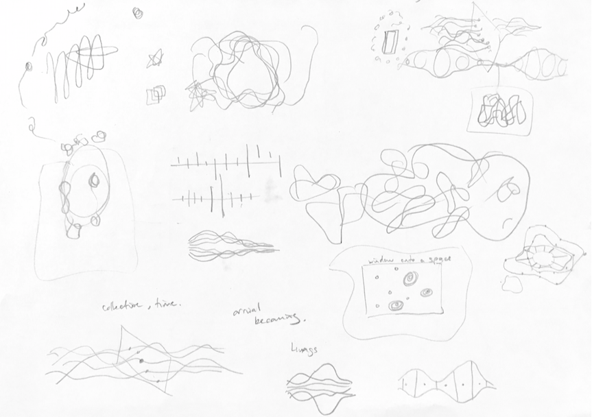
Early sketches were made, thinking about how breath might look, without regard to computing approaches.
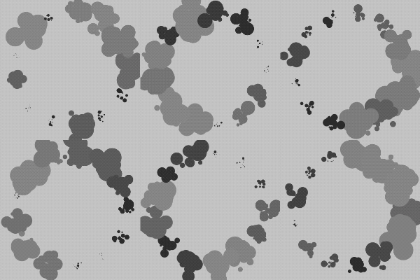
Many animated sketches were made in 2d in p5.js, using a number of visual techniques, to represent breathing. While some of these are extremely organic and comprise hundreds of separate elements, these are all responding to a single breathing cycle from one individual (simulated by a sine wave).
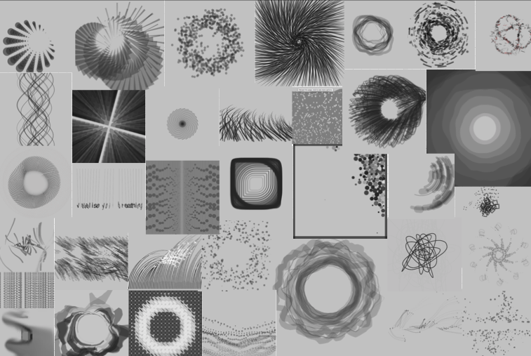
For the limited screen space and performance limits of a mobile device, those that combine simple geometry with fewer elements are the most satisfying. For a more powerful graphics engine, and a far higher pixel count of a projected or wall mounted screen in the studio, more organic forms, employing many elements, and using noise driven variations are possible. These experiments allowed me to find the range of what is possible, and what is interesting while remaining true to the essence of breathing.
Moving to representations of multiple breathing rhythms, I took some of the previous ideas and used layered arrangements of relatively simple forms, each representing a single breather. I wanted there to be both a sense of the individual rhythms, and the creation of some new entity emerging from the combination of the cycles.
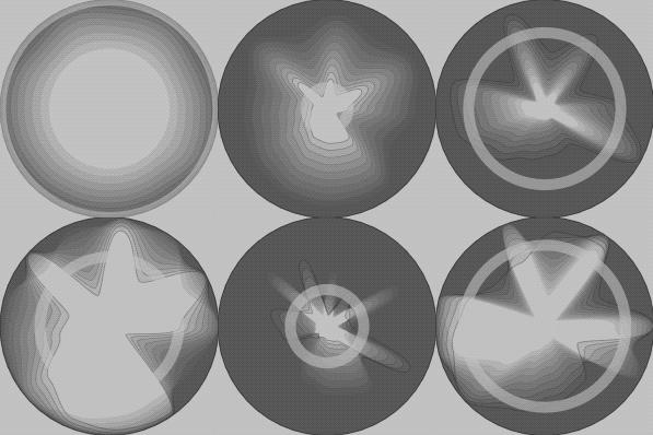
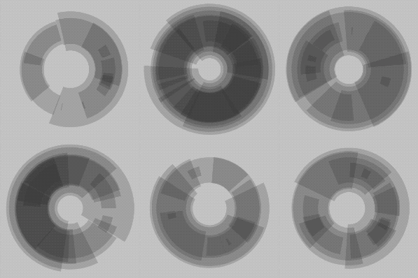
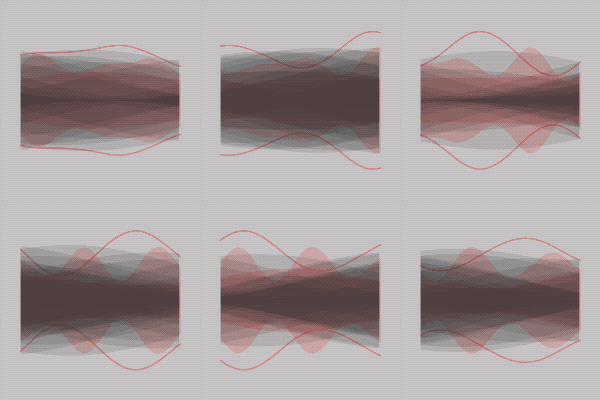
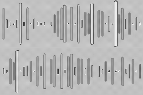
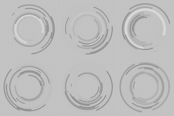
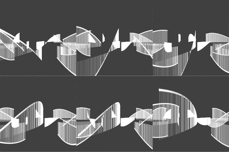
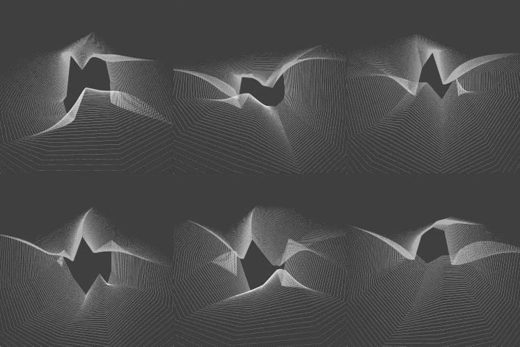
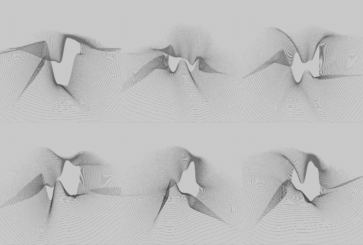
Of these designs, the arrangement of concentric rings and overlaid waves both appealed to me. In the following experiments, I took the first of these and developed a 3D rendering in Processing. The GIF’s show an evolution from points in 3d space, to joined vertices, and finally bezier curves. The heights of vertices represent the instantaneous values for an individual breather, with past values radiating away from the centre. Joining these vertices with curves creates a sense of an emergent organic form, while not losing the contributing breathing rhythms. A further step will be to create polygon meshes from the vertices.
Colour Experiments
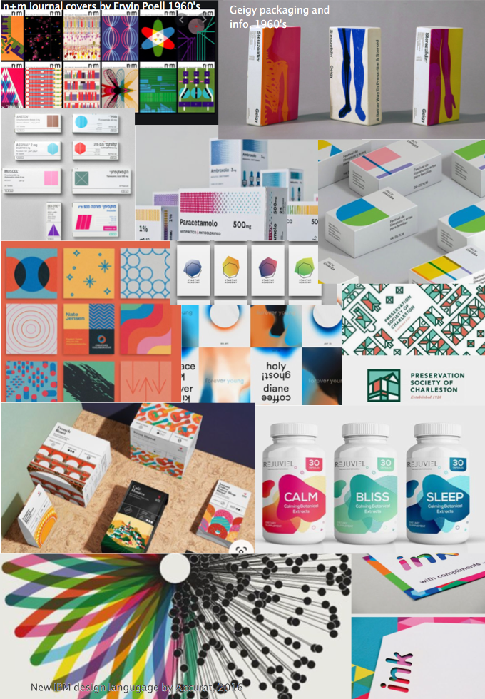
All the animated and visual experiments were in monochrome to allow a focus on form and representation. For colour, I was inspired by the use of flat, neutral backgrounds with bold geometric shapes in mid-saturated colours used in pharmaceutical packaging and other designs in the 1960’s. More recent variations on this have explored colour blending, half tones and more complex, but repeated motifs.
Some of these designs reduce ideas that are inherently complex and use simplified, diagrammatic representations, in a reduced, bold palette, thereby giving clarity. Others use simple geometry in complex arrangements but with use of only a few colours. Hues that are less fully saturated give a calming effect, yet they are bold enough to be pleasing. Many designs have a large proportion of white/neutral space with a very clean typeface. Elements are not competing for attention. They are calm and clear, even though the high contrast attracts interest.
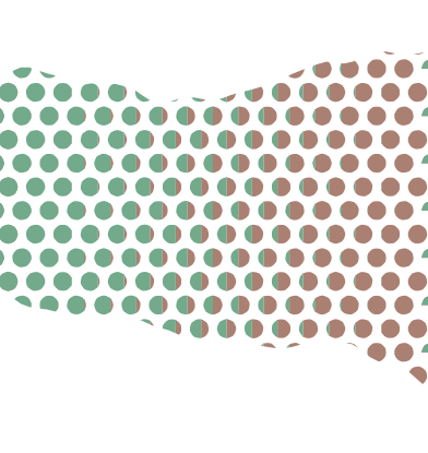
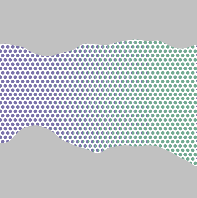
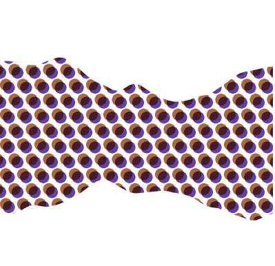
I experimented with using a halftone matrix of two blended mid-saturated hues, masked by organic shapes against neutral backgrounds to see how this approach could fit my animations. I did not find this to be a satisfying look.
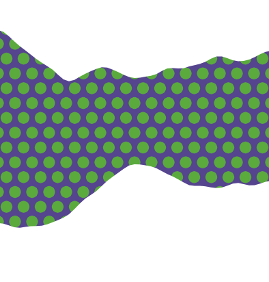
Separately I experimented with using simple representations of breathing using these mid saturated colours, playing with colour blend modes as well. I feel this is a stronger approach to applying colour to visualisations.
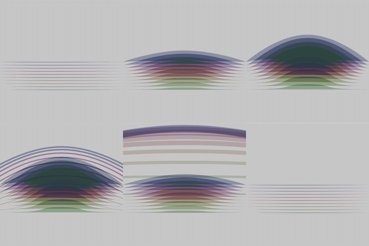
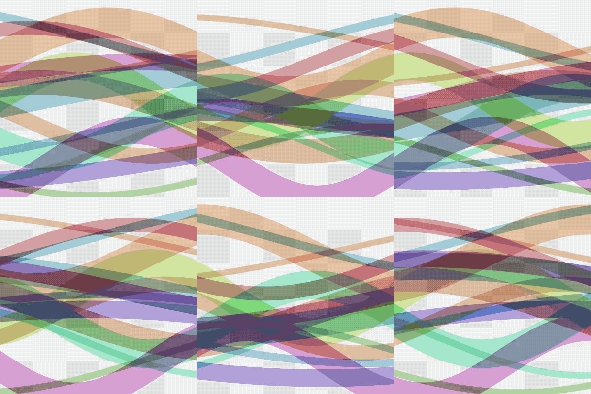
These last two experiments blend a complex arrangement of simple shapes, and using blended block colours to bring a richness, without losing the identity of individual elements.
User Experience
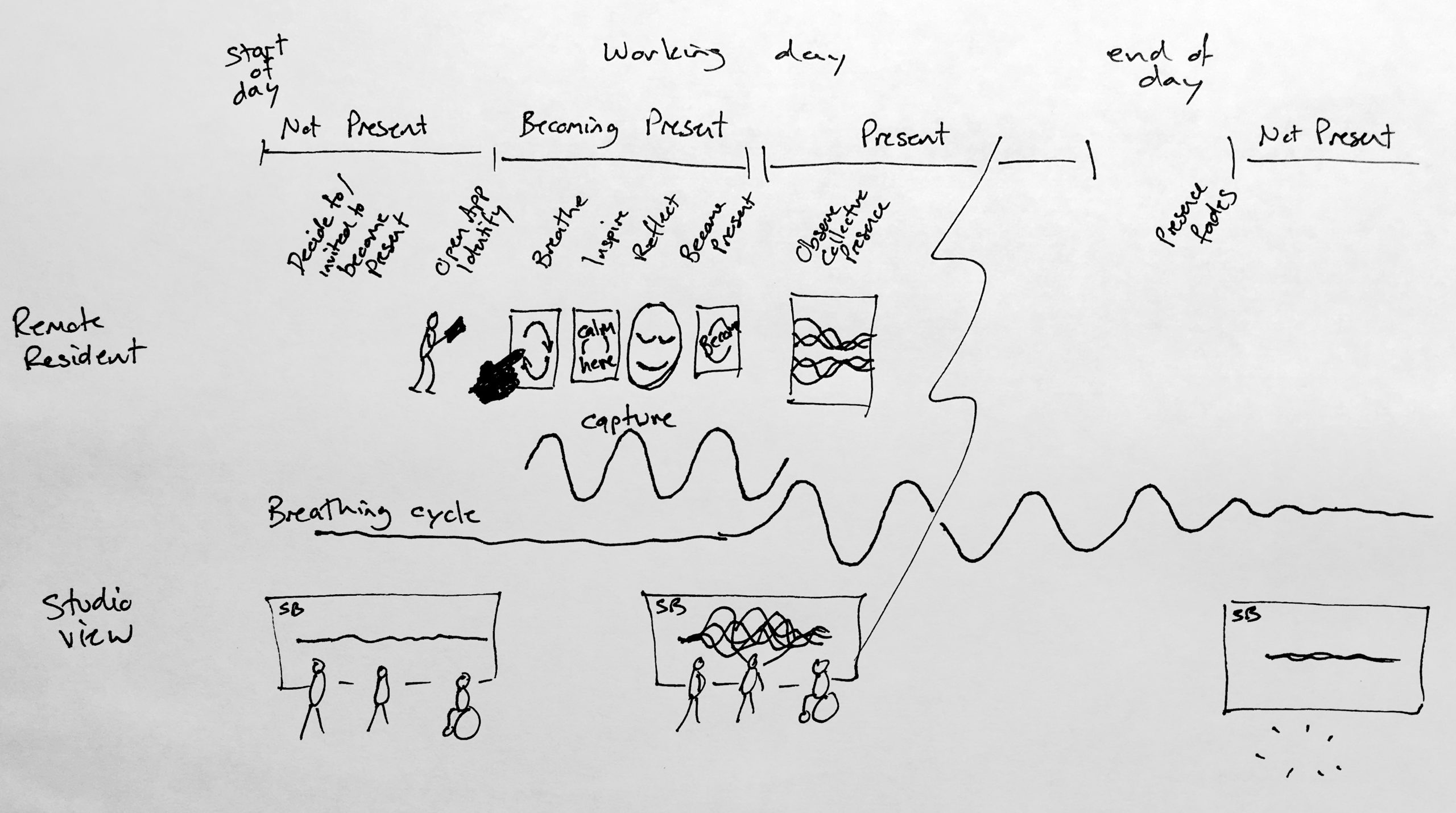
The user experience is intended to feel like an act of becoming present, of becoming aware of others and visible to others. While it technically must be transactional, the aim is to make it feel unlike a typical mobile phone app.
The studio view will visualise the individual and collective breathing patterns in a number of ways. Residents attending the studio in person will check in by a similar method, so that both remote and colocated residents can see the presence of others and be present themselves.
Interface Development
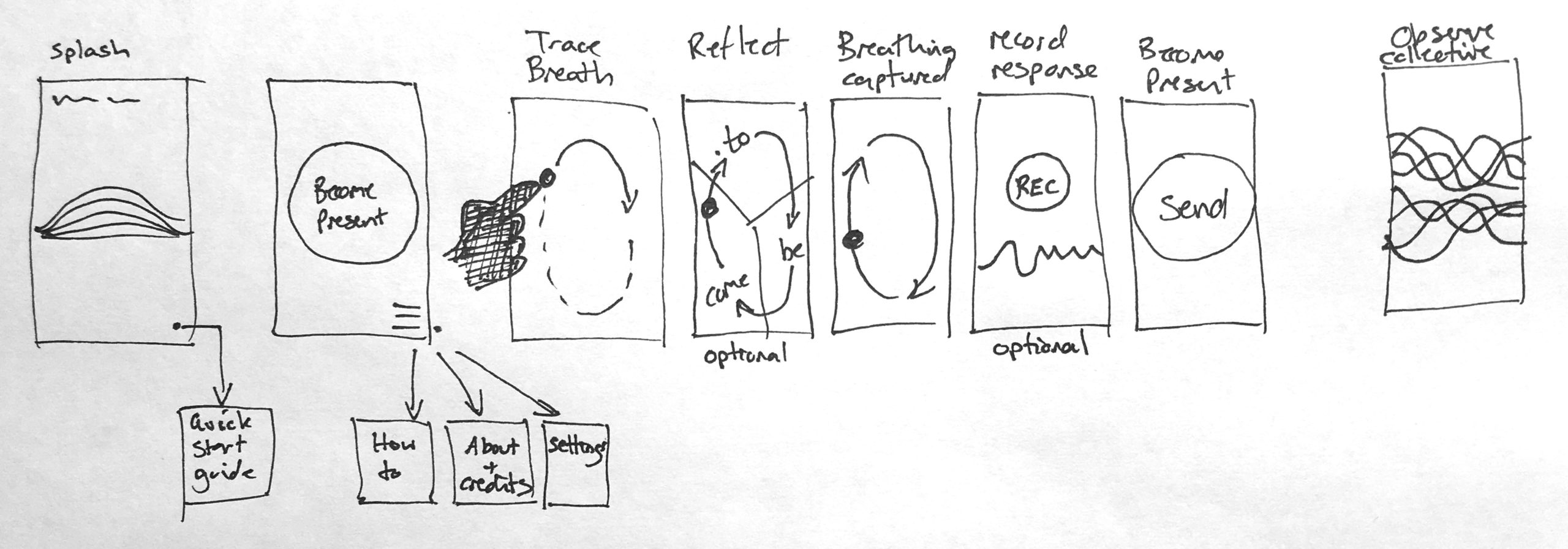
Overall User Interface design has not been developed beyond the concept shown, howver experiments with breathing capture using the device have been performed.
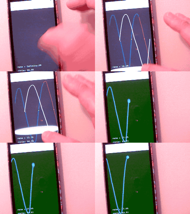
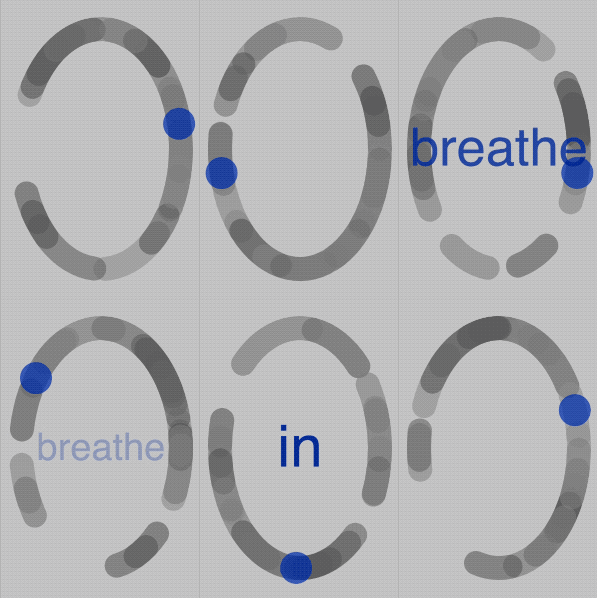
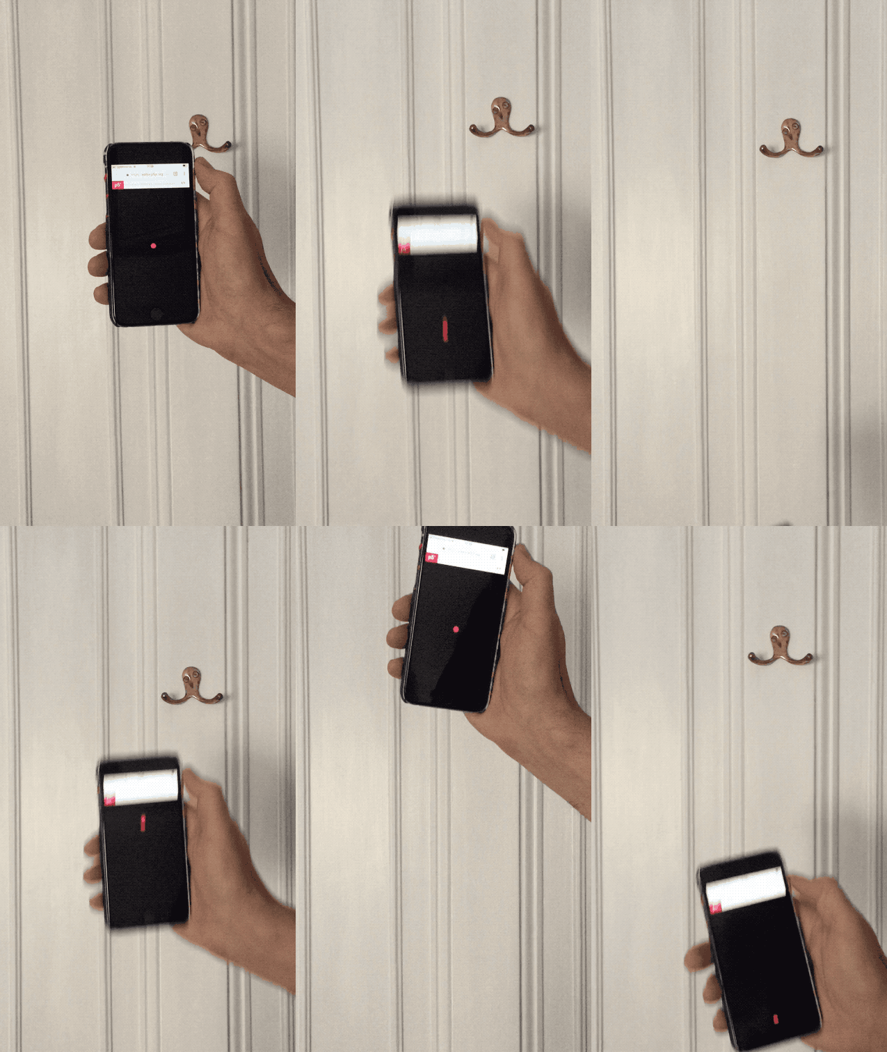
Experiments in capturing the breathing cycle
The top left image shows a sketch to capture a breathing rhythm by tracing touch on the device screen. When 5 cycles have been traced, an average cycle automatically carries on. The GIF on the lower left shows a more attractive interface for this trace, with the addition of prompts triggered by position within the cycle.
The GIF on the right shows the result of a number of experiments with accelerometer data responding to motion. The results have been somewhat unreliable in trying the control a smooth motion of the red dot by motion. It would provide an appealing interface to trace breathing through a motion, but more calibration and control is needed before this could be usefully employed.
Technology and Architecture
The project requires different areas of functionality, experienced from different situations and locations, to achieve an overall successful experience. The diagram shows these areas.
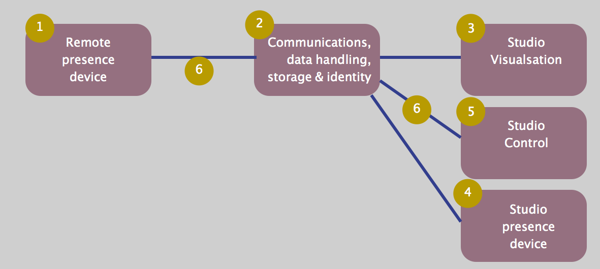
These elements are defined and discussed here.
1. Remote Presence Device
A remote participant will need to use a phone or a web browser to participate, and indicate their presence.
This could be achieved through a fully native mobile app, or a web-to-app framework such as React or Vue. These frameworks have a great deal of built in capabilities for user interface building and libraries extend this to almost every conceivable possibility. Possible downsides are that I do not want the user experience to feel aligned to typical app experiences, and I want to use animations and atypical interactions. Frameworks certainly do not preclude these needs, but some of their advantages dissappear.
An alternative is to use a natively graphical framework (such as Paper.js or P5.js) to build a web app, focussing the experience on fluid animation, rather than transactional steps. The downside is that UI design can be laborious, and many features will have to be coded from scratch.
The latter is the chosen approach because I am familiar with use of p5.js, and learning to use a UI framework or native development system from my novice understanding, and outside of its typical use would be expensive in terms of time.
2. Communications, data handling, storage and identity
Given that some participants are remote and the central visualisation occurs in another place, we need some infrastructure to provide a common communications channel, a way of exchanging and storing data, and some simple identity management. Frontend frameworks, mentioned in the previous section, come with most of these needs met in packaged front/back end arrangement that takes care of exchange of data in near real time between devices. However, most of these capabilities can also easily be provided by a server running node.js, with various packages added to provide the needed capabilities. For this project, these include:
- serving web pages
- simple identity services
- realtime data exchange (websockets)
- JSON data structure handling, and either
- a local database or
- access to remote data services such as Firebase
The Node based approach seems a suitable fit here.
3. Studio Visualisation
We want the studio based visualisation to be high impact in terms of scale, richness and performance. A graphics language/platform such as OpenFrameworks, Processing or Unity could work here. Unity does not lend itself to generative geometry or ‘free’ drawing, although it is possible, and certainly it has plenty of other appealing capabilities. OpenFrameworks is very powerful, although it is unfamiliar to me. Processing, while not as fast as Unity or OpenFrameworks, should be more than capable of driving the kinds of visualisations I have in mind without difficulty. It is also appealing due to my familiarity with it.
4. Studio Control
An installation style, data-driven animation would not provide a native interface to provide control, without becoming intrusive. An alternative can be achieved through a functional web-connected console, allowing runtime changes to be made to the display.
Such a web console can be connected through the same means as the remote web client.
5. Studio Presence device
A partcipant attending the studio in person will have a slightly different experience, but this can be facilitated using the same technology and interface as the remote client. In some way the differences can be detected and used to modify the experience in appropriate ways.
6. Shared Communications medium
Websockets seems a sensible choice for communication between the various components. It allows near realtime esxchange of messages between the connected clients, and is available to all technologies (Node.js, web clients, and Processing). Messages can include JSON to carry data structures, which could contain control signals and breathing data. The server (element 2) will be publicly hosted, so these messages will be travelling on the public internet.
Testing the infrastucture components
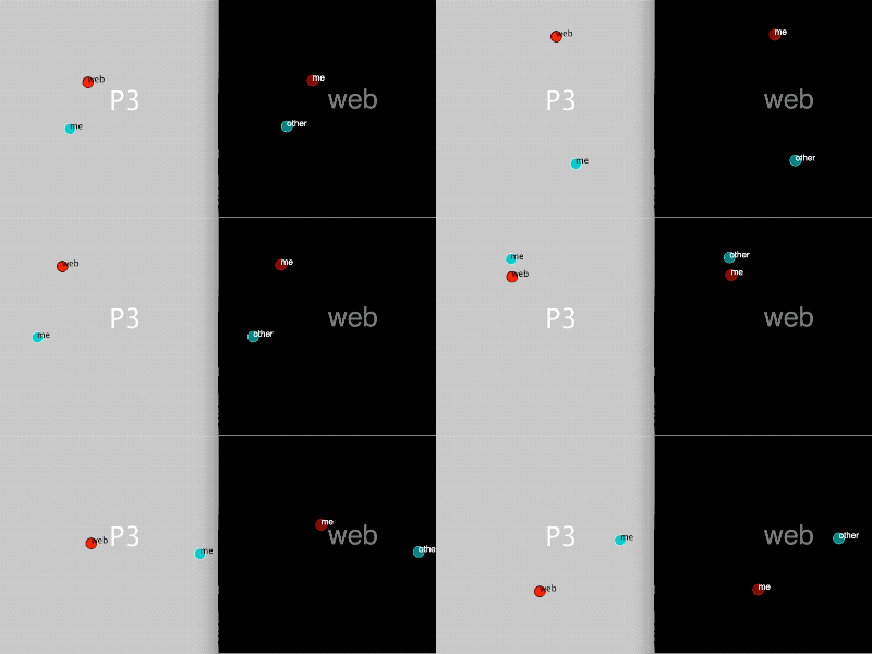
This experiment shows the realtime communication between a p5.js sketch running in a web browser, and a Processing sketch, sending x,y coordinate data as JSON, via a Node.js server, using websockets messages. All processes are running on the same computer in this test.
Production Schedule
While collaborating with others for artistic direction and the ideas behind conscious breathing, the development of the computing artefact is down to me alone. Therefore multiple workstreams will develop in parallel. Detailed scheduling at task level does not seem practical, however working to interim deadlines works well. Work to date has been largely driven by module assessments. An opportunity exists to present a partly complete protptype of the project when the Studio opens on the 1st September. This provides a goal for developing each of the streams to a working state and integrating them. It also provides an opportunity to seek critical input and consider changes for final submission three weeks later.
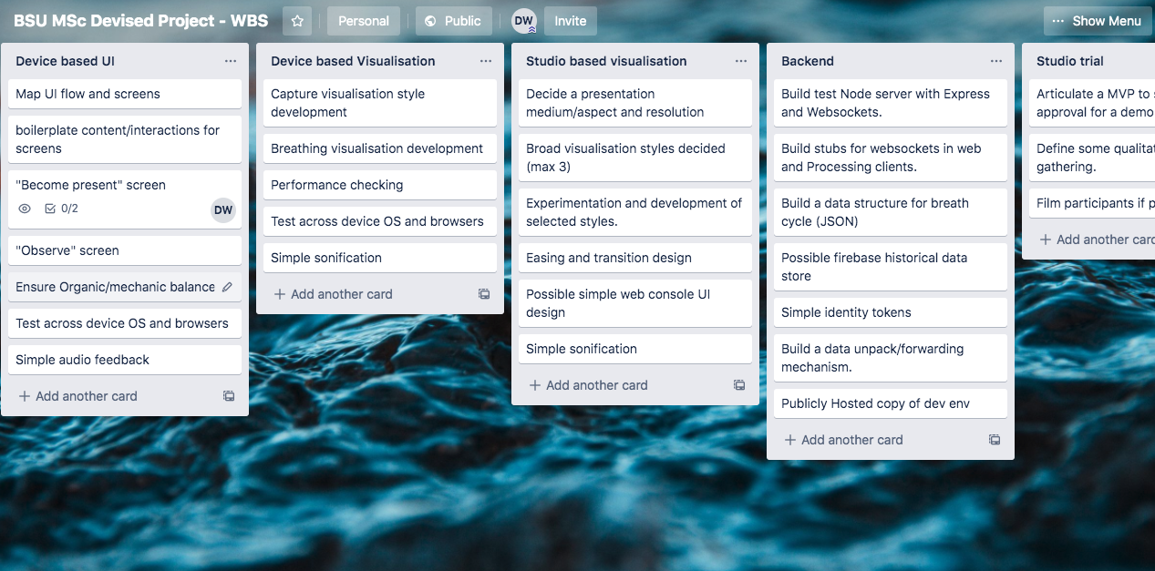
The chart below shows an approximate breakdown of works streams and key dates.
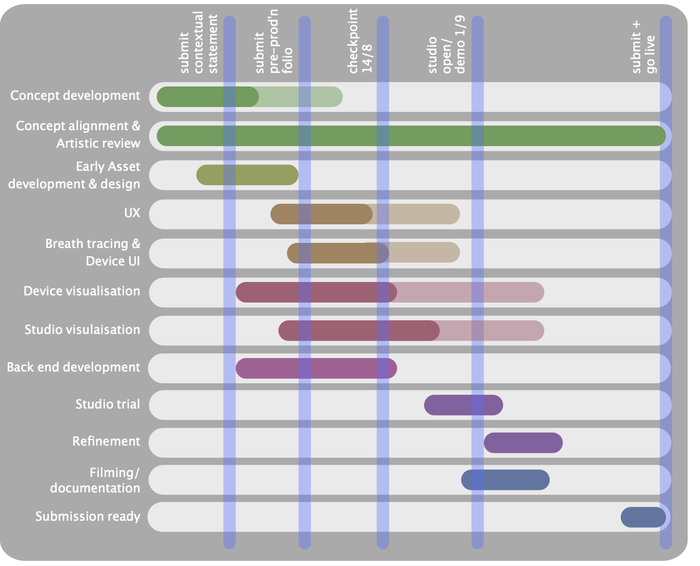
Detailed breakdowns of each workstream into tasks can be fond in the linked Trello board.
Resources
The following resources are needed to complete development and submission of a devised project artefact with video documentation. Most have been secured.
-
Breathing expertise
-
Breath and telematic based art consultant
-
Friendly studio residents/participants
-
Development software and libraries
-
Visual design skills
-
Visual design inspirations
-
Audio synthesis/modification expertise
-
Filming equipment
-
Video editing software.
-
Studio based screen/projection and device to run this from.
- Cloub based server/App hosting
Reflection
The project has many separate technical and creative elements. In addition, my desire is that the overall experience should feel organic and artistic, rather than transactional. This gives me a great deal to achieve in the available time, and there may need to be some compromise in scope to ensure that the included elements are complete, robust, and satiusfying for users. I believe that a focus on simplicity of each element, and aiming for stability and completion over ambitious aims at each step, should lead to success.

